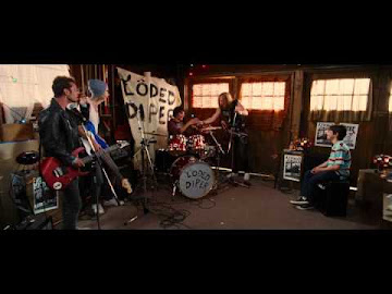
Here is the Print Component for my film promo, the film's poster for theatrical release. There was a lot of thought that went into creating this poster.
The first thing I would like to discuss is the font. At first I wanted to find some font that looks similar to that of the band "Metallica." For Canva, the platform I used to put this poster together, I could not find anything very similar without it being too big or just not fitting well. That's when I decided on the one that you see. It has the rock-and-roll feeling while being clear and a little roughed up which is similar to the band itself.
The composition is also inspired by common comedy movie posters. Many will a simple or nothing going on in the background and have their main characters in a funny pose that fits the film's plot and genre. I tried this myself by having the group mess up, something they commonly do, and have that be the basis of the poster. The other characters are reacting to this happening and this creates a funny scene within the poster.
I used the idea that I discussed Miguel suggested by doing a very homemade looking scratch out of the four and the writing of three above it. I did this so that it looked as if one of them did on the poster. It looks like they told the people making the poster to do something, but then had to go back and change it themselves because one of the members quit.
.png)


No comments:
Post a Comment