The project represents a couple different groups. One group that is represented on the surface level is the Latin community through the casting. Everyone, from the main character to the slightly featured ones in the trailers, is of Latin descent, but I do not have anything explicitly representing those groups. The main group that I feel I am representing is a group of struggling musicians. Music is one of the most difficult fields to go into because it is highly competitive and is based very heavily on the opinions of others. These trailers are able to demonstrate these struggles by showing the struggle of finding a proper venue to perform at. Anything they find just does not work out for them, and this displays how difficult it is to start a band from nothing.
Another thing that I attempted to represent is the sacrifices and internal struggle that come with pursuing dreams. The main character, Jonathan, is a very talented musician; however, his friends are not. He thinks that he can do it alone, but he has issues leaving his friends behind in the process. He learns about the sacrifices that must be made when things fail and needs to learn how to balance his career and his own life.
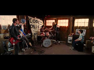
For the branding, I used the look of the classic angsty teenage band in their parent’s garage to dictate the beginning of the trailers. I drew some inspiration from the band “Loded Diper” from the “Diary of a Wimpy Kid” films. Their rundown, unprofessional setup was exactly what I had in mind for the characters in my trailer, and I tried to create something similar.
The main purpose of these trailers is to be funny, and that was my main focus. Most of the writing and cut scenes were dictated by what I believed to be the jokes that would translate best to audiences. The branding was to create a very laid-back, inexperienced group that consistently crumbles. Simplicity was key, as I wanted the main focus to be writing and comedy.
The heavy focus on comedy and the style of comedy, which admittedly is a little immature, is the way I plan on engaging with audiences. The target audience is young adult men because of its R-rating, but mostly because of its story and humor. The characters also reflect this, as they are also young adults and can have a relatability factor to them.
I felt as though I challenged the conventions of a regular comedy film by including challenges that the characters go through. I think that with these challenges, these characters are more fully developed, and the story focuses on not only the plot in the comedy but also the characters themselves. I also think that the story challenges conventions by being a very touching story about friendship and the importance of following your dreams.
The print component of my film was an easier part of the process to put together. Everything, from the image to the font, had its purpose. The image was a clear display of the branding of this film. It is an image of the band messing up, as is what they very commonly do. It took a couple takes, but eventually I got the perfect shot.
For the background, many comedy movies will use something blank or less distracting to have the subjects really pull focus. With a simple blue background, people’s attention will be diverted toward what the subjects are doing. The background is also meant to be more lighthearted and reflect the comedy and friendship aspects of the film.
The font fulfills a similar purpose. It has the rock-and-roll feeling while being clear and a little roughed up, which is similar to the band itself. The design and color of the font also allowed for the bit of crossing out the four and instead writing three easier and translating better to audiences.
The Instagram is also reflective of the group. For my “Meet the Cast” post, I had asked the group to send me both nice photos of them, as well as some more casual and humorous ones. With each “Meet the Cast” comes a following post with my favorite blooper while filming. This is what I wanted to do to engage audiences. When a production posts bloopers, people want to watch more and find out what those will lead to. They also create a personal connection with audiences and make the characters feel more relatable.
Overall, the portfolio project never fails to stress me out. It was a big task to take on by myself, but with the support of cast mates and friends you realize that it can be done if it is taken day by day. Looking back, I wish I had more innovative ideas for the social media, but I feel like I accomplished what I set out to do.


.png)

.png)
.png)


No comments:
Post a Comment